Every agency has delivered a beautiful brand guidelines document and then, six months later, watched the client's new website launch with a stretched logo in the wrong green. The document was not wrong. It was just not where the developer looked, and it did not contain the thing the developer needed.
Guidelines are only worth what people do with them on an ordinary Tuesday. That changes what belongs in them, how they are delivered and, most of all, how they are kept.
Write for the people who will open it
The audience for brand guidelines is rarely the marketing director who signed off the identity. It is the in-house designer making a flyer, the freelance developer building a landing page, the printer quoting for signage, the influencer agency adding a logo to a story, and the new marketing executive who joined after the rebrand.
Each of them arrives with one question and wants the answer in under a minute. Long passages about brand essence are fine to include, but they should not stand between a reader and the logo file.
What belongs in the book
- Logo files in every version the brand uses: primary, secondary or stacked, the mark on its own, and one-colour versions for dark and light backgrounds.
- Clear space and minimum size, shown on the logo rather than described in a paragraph.
- A short list of things not to do: stretching, recolouring, adding effects, placing the logo on busy photography.
- The colour palette, with every code a supplier might ask for.
- Typefaces, with their roles, weights and where to get them.
- Photography and illustration direction, with real examples of what is right and what is not.
- Templates for the things the client makes most often: social posts, presentations, email signatures.
- Arabic treatment, if the brand works in both languages: the Arabic logo lock-up, the Arabic typeface and how the two sit together.
If the brand has a tone of voice, add a page on it with examples of sentences that sound right and sentences that do not. A list of adjectives is not guidance. Two sample captions are.
Logo files in every format
A PDF that shows the logo is not the same as a logo someone can use. Provide the files themselves, named clearly, and group them by use rather than by format.
- SVG for the web and for anyone who needs to scale it.
- PNG with a transparent background for presentations, documents and social.
- A vector file for print, usually EPS or PDF, with any print-specific colour versions.
- A square version of the mark for profile pictures and app icons.
Name files so a stranger can pick the right one: brand, version, colour and format. A folder of files called final, final2 and logo-new is how the wrong version ends up on a billboard.
Colour codes in every format
Colour is where guidelines most often fail in practice, because each supplier works in a different system and each one asks for theirs.
- HEX for web and digital design.
- RGB for screens, video and presentation software.
- CMYK for print.
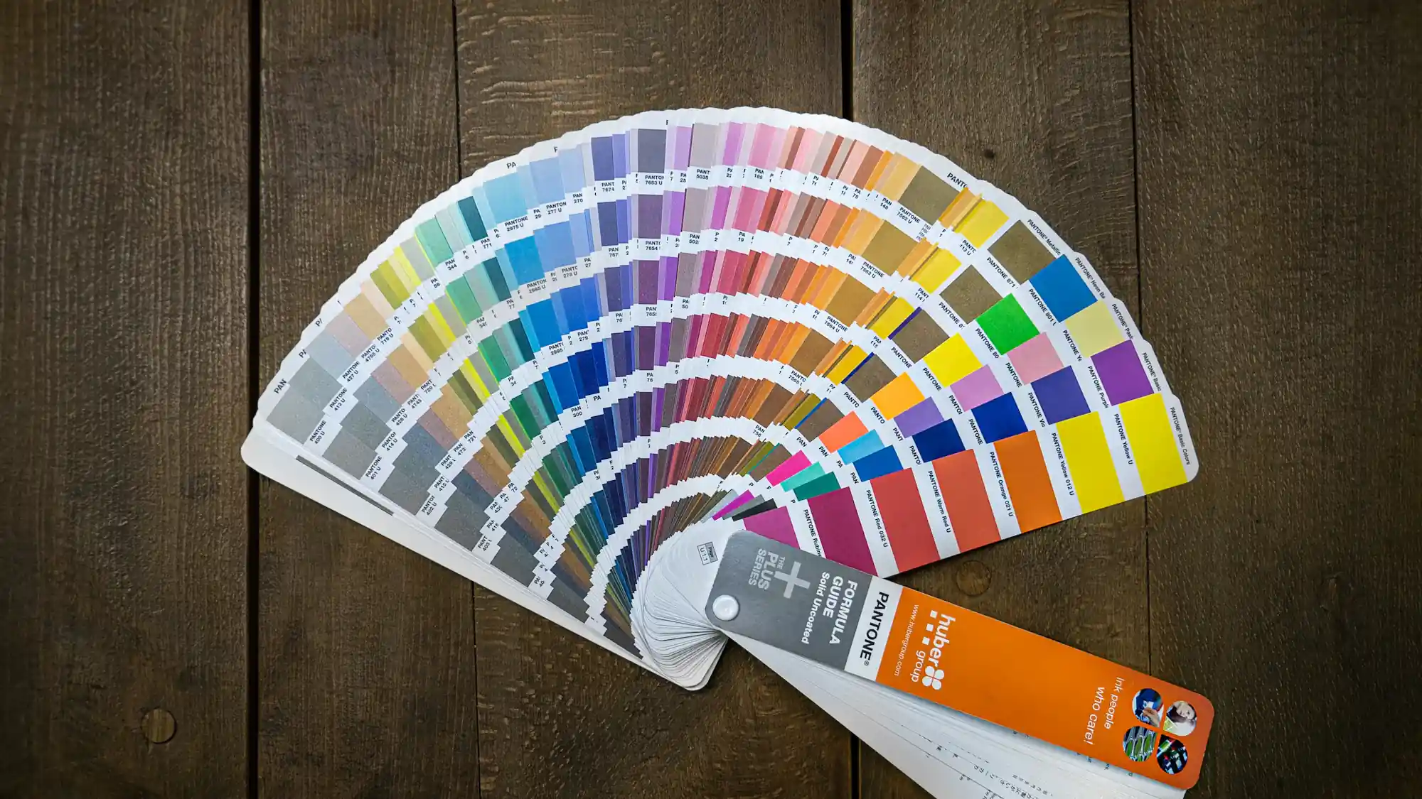
- A Pantone reference, where the brand has specified one, for print jobs that need an exact match.
Name each colour the way the brand refers to it, so that a note saying use the sand, not the cream, means something to everyone. Converting between systems is not always exact, particularly from screen to print, so where a printer has matched a colour on a physical proof, record the values they used rather than relying on an automatic conversion.
Fonts and licences
Listing a typeface is not the same as giving someone the right to use it. Many commercial fonts are licensed per company, per number of users or per use, such as desktop, web or app, and the licence that covers the client's design team may not cover their freelancers or their website.
Say which fonts are free to use and where to get them, which are licensed and who holds the licence, and what to use as a fallback when the brand font is not available, for instance in email or in a slide deck opened on someone else's laptop. If the client has not bought a licence the brand depends on, raise it at handover. It is a small conversation then and an awkward one after a supplier has been told to stop using the font.
One current version
Guidelines decay the moment they are sent as an attachment. A copy lives in an inbox, another on a shared drive, a third on a freelancer's desktop, and the day a colour is adjusted, two of the three are out of date without anyone knowing.
Keep one live version in one place and send people a link to it rather than a file. When something changes, change it there, note the date, and tell the people who use it most. Older versions can be kept for reference, but they should be clearly marked as superseded.
The best brand guidelines are not the most detailed ones. They are the ones where the right logo is two clicks from a link everyone already has.
Sharing without friction
Anyone who needs the assets should be able to open them without creating an account, and download what they need without asking. Every request that has to go through the agency or the client's marketing team is a request that someone will eventually skip, by pulling a logo from a search engine instead.
That is the idea behind Wiro's Playbook: a book per client with boards for files, colours and fonts, colour codes shown in HEX, RGB and CMYK with Pantone where added, and a share link that opens in a browser without an account. However you deliver it, the test is the same. A supplier who has never met the client should be able to find the right file on their own.